X
Top Digital Marketing Agencies in The World – Expert Reviews
Jan 04, 2024
Business Owners around the world hire professional agencies to market their company products or services online. But due to the wide variety of such agencies on the internet, they might get confused about which one to choose.
To solve this problem for you, we have crafted a list of top-notch digital marketing agencies and explained them briefly. We hope that this listicle will help you narrow down the list of agencies to choose from.
But before getting into this list of agencies, let’s give you a brief overview of how they work.
What Are Digital Marketing Agencies?
Creating a presence on the web is a task that requires a certain marketing skill. It isn’t something that a man in the street would be able to accomplish. Knowledge about SEO, keyword marketing, email marketing, and many other factors is required to structure a winning SEO strategy.
This is where Saas Digital Marketing Agencies come in. They handle all these technical aspects for you and report the progress. With the help of these agencies, you won’t have to worry about the marketing aspect of your business. Now let’s talk about a few of such companies that can prove beneficial to you.
Best Digital Marketing Agencies According to Experts
In this list, we have explained some of the prominent features of all the top digital marketing platforms online.
Bright Local
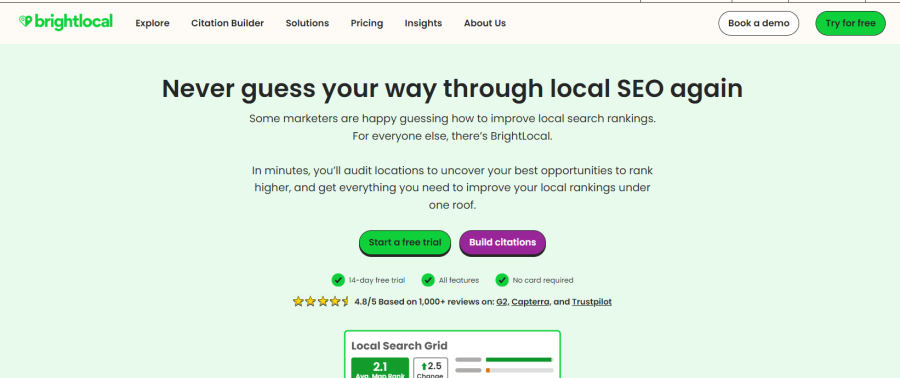
This SEO company specializes in offering services and products to improve local SEO. They do everything from local SEO audit and reputation management to local ranking reports.
Bright Local provides reports in the form of graphs and statistics that give you the perfect picture of your site’s search engine ranking. These reports also suggest which areas of your SEO strategy require modification.
Key Highlights & Areas of Expertise:
⦁ Free Local SEO Training and Tools
⦁ Unlimited Walkthroughs and Demos
⦁ Comprehensive Local SEO Audit
⦁ Live Chat Support 23 Hours A Day
Pricing:
They offer a free 14-day trial period without asking for credit card info. Users can go with any plan based on their requirements. By switching to yearly payment, users can save up to 25%.
Crazy Egg
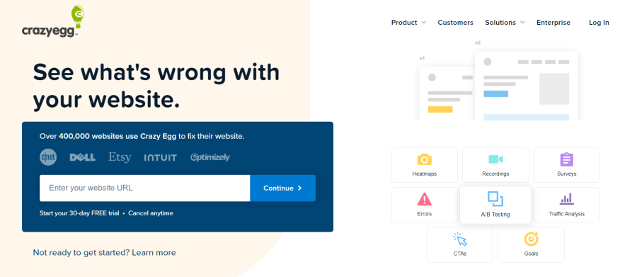
Crazy Egg provides insights into user behavior on your website. The reports of user behavior are presented to you in the form of heatmaps (of clicks) and recordings of individual sessions. By analyzing the activity of your audience, you can get a better understanding of what are the things you need to keep or change in order to improve user experience.
In addition, this tool helps you understand if any error on your website is affecting conversion rates on your website.
In order to optimize your website according to the preferences of your audience, you might want to know the sources from where your audience is reaching you. Crazy Egg also provides a feature that lets you know the unknown sources of your traffic along with the performance of other marketing channels that you might have set up.
Key Highlights & Areas of Expertise:
- Provides heatmaps (of clicks) and recordings of individual sessions to understand user behavior on a website.
- Allows analyzing user activity to better understand what needs improving or keeping for user experience.
- Helps determine if any website errors are affecting conversion rates.
- Provides information on traffic sources including unknown sources and performance of other marketing channels.
Pricing:
Users can choose from three packages: Plus, Pro, and Enterprise. It also comes with a 30-day free trial.
The 215 Guys
This is a company that can assist you in creating a web design that suits your needs. It is an experienced agency that has been functioning since 2015. They provide a bunch of interesting services related to web design.
For instance, designing e-commerce web pages for selling products is a service that they provide. After creating a web design, they offer maintenance as well as search engine optimization for better ranking in search engines. Services like these significantly improve your digital marketing campaign.
Website designs provided by this company are eye-catching. But that’s not all. Their websites are also very functional. That’s the reason why these sites provide a great user experience for your audience.
Key Highlights & Areas of Expertise:
- Specializes in creating e-commerce websites
- All-inclusive search engine optimization
- Conversion optimization
- Complete website maintenance
Pricing:
This agency doesn’t have any specific or fixed pricing plans. People can contact them to get a quote for the service they are looking to hire.
Creator IQ
This agency is an influencer marketing software platform. This includes social media influencers or content creators. Creator IQ finds the most appropriate influencers that are fit to represent your brand.
Such a platform will help you decide the next step of your marketing campaign. Similarly, this platform provides services to increase your brand awareness and loyalty. They provide you with an audience that is interested in what you offer.
One of their features includes goal-driven marketing campaigns. This allows you to reach the desired outcome efficiently.
And finally, they provide reports filled with metrics that inform you whether your marketing efforts are successful or not. If you don’t see your expected results, it means a change is required in that part of your campaign.
Key Highlights & Areas of Expertise:
- Ideal platform for creator-let marketing
- Track conversions managed and driven by creators
- Allows you to build you’re a loyal fanbase for your brand
- Offers recommendations for areas that need improvement
Pricing:
This agency doesn’t offer specific or fixed pricing plans. People can contact them to get a quote for the service they are looking to hire.
Insivia
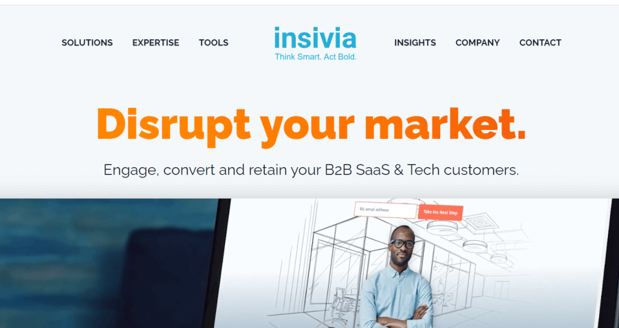
Insivia is a company that provides services related to marketing techniques that will help you grow your brand. They adapt different strategies to convert normal visitors on your site into actual buyers.
First of all, they understand the nature and preferences of your audience and then implement the required strategies. These strategies include psychological techniques to grab a user’s attention and convince them to make a purchase.
Furthermore, they provide web designing services. Their web designs are created in a way that attracts your target audience because the needs of your audience are always kept as a priority in their marketing plan.
All these efforts will ultimately result in improved product and market-qualified leads and hence, increase sales.
Key Highlights & Areas of Expertise:
- 21 years of experience in the industry
- Complete solution for B2B SaaS and Tech customers
- Expert strategies to engage, retain, and convert potential buyers
- Also specializes in web designing services
Pricing:
There are no fixed pricing plans. A quick quote is provided after evaluating your specific needs and goals.
Mr. and Mrs. Leads
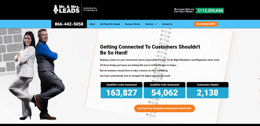
This online digital marketing agency guides you on how to expand and grow your company or brand mainly by helping you understand your audience. Their services range from local marketing to Google and Facebook advertising and even app development.
One of the interesting features that Mr. and Mrs. Leads offer is a free competitor comparison attack plan. This feature delivers a video that explains all the possible steps that you need to take in order to get an increased number of customers. This video comes without any cost and requires very basic information like your website address and the target keywords.
They also have guides on how to get increased visibility on Google, which is the basic goal for most companies that are striving to expand their work.
Key Highlights & Areas of Expertise:
- Specializes in digital marketing and local SEO services
- Also offers web designing and PPC services
- Same Day Support
- Free Education Material
- No Hidden Charges
Pricing:
There are no specific pricing plans. They charge differently based on their customers’ needs and criteria.
Hook Agency
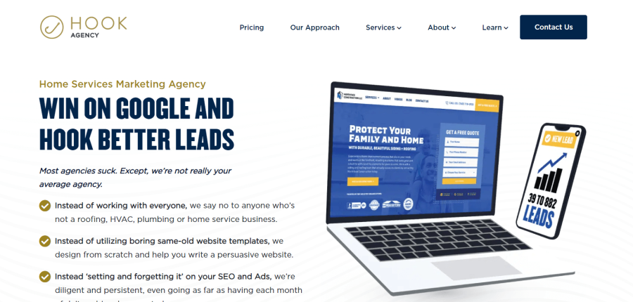
Hook agency provides services that help you rank higher in search engines and attracts more organic traffic. In other words, this marketing agency is focused on improving the SEO of their customers’ websites.
They also provide writing services that can create articles and web pages containing relevant and effective keywords in order to bring in organic traffic and increase your visibility in search engines. Moreover, they can also assist you with paid advertisements.
They claim to perform all the technical work by themselves while keeping the customer’s preferences in consideration. In this way, their customers are only concerned about informing the agency about their needs and reviewing the monthly reports provided by Hook agency.
Key Highlights & Areas of Expertise:
- Search Engine Optimization
- Website Designing
- Paid Ad Management
- Amazon Services
- Free Demo
Pricing:
They offer three pricing plans: custom website, SEO, and PPC management. You can go with any of them, depending on your preferences.
Rankup4U
Rankup4U is your dedicated partner in digital marketing, accelerating growth and boosting online visibility for brands of all sizes. Specializing in comprehensive website analysis, they unravel key improvement areas to enhance your digital presence.
Through a blend of SEO expertise and content optimization, Rankup4U ensures your brand not only stands out but stays ahead in the digital race. Their team conducts in-depth keyword research and curates engaging content that draws organic traffic, amplifying your brand's digital footprint.
Furthermore, they excel in backlinking, a critical strategy to push your website higher in search engine rankings. Their commitment extends beyond immediate solutions, providing insightful performance reports to highlight victories and suggest next steps for continuous growth.
Key Highlights & Areas of Expertise:
- Social Media Marketing
- Advanced Analytics
- Paid Search Advertising
- Content Strategy
- Email Marketing
- Local Search Strategy
- Map Search Optimization
Pricing:
Varying pricing for services they offer. Contact them for more details. They also offer a free Quote.
Zen Business
Zen Business provides facilities regarding filing and other official processes for new businesses. For example, if you want to open up a business in the United States, you need to set up an LLC. This process can be done by providing the required information to Zen Business, and they will do all the work for you.
Additionally, they give you the option to have access to a personalized dashboard to store all the necessary information once your business is set up. This means that you will be consuming their services throughout the life of your business.
A unique offer provided by this company is that their basic plan is free. It only charges the state filing fees that is paid to the higher authorities. And even for the paid plans, there is a refund policy. So, this proves that their services are legit and might be a good choice for you.
Key Highlights & Areas of Expertise:
- Offers services accommodating online side hustles
- Delivers all-inclusive solution for setting up an LLC
- Provides 100% guarantee
Pricing:
There are three types of packages they offer: Starter, Pro, and Premium, with each coming with a different set of features and functions.
Stuart McHenry Consulting

A lot of unique features related to online marketing are provided by this agency. Services like Google penalty remover and website speed management are not very common among marketing companies such as this one.
However, they claim to be experts at one of the more common services provided online, which are content Marketing and backlinking. This is because their main goal is to provide the customers with increased exposure in the online market and thus improve their sales.
Their main target is ranking higher in organic search. One of the ways by which they do so is by finding the most relevant and valuable mediums where linking or marketing your site will provide maximum results in terms of organic traffic.
Key Highlights & Areas of Expertise:
- Link Building Services
- Google Penalty Removal
- SEO Audits & Local SEO
- Reputation and Social Media Management
- Free Quote
Pricing:
This company doesn’t have any specific or fixed pricing plans. You can get a quote for the service you seek by contacting them.
Timmermann Group
This is a St. Louis-based agency that aspires to market both B2B and B2C companies (Business to Business and Business to Customer, respectively). They provide all forms of marketing services, such as social media, SEO, web design, etc.
Their unique factor is that they don’t only give insights or plain data but also convert them into strategies for improvement. This makes it easier for their customers to determine the next step in their marketing campaign.
They have satisfied customers because they value the vision and preferences of their customers. For this reason, they are able to make long-term relationships with their customers.
Key Highlights & Areas of Expertise:
- Wealth management and protection for Pre and Post Retirees
- Offers actional plan to improve growth
- Fully equipped to handle all your tax issues
Pricing:
There are no specific pricing plans. They charge differently based on their customers’ needs and criteria.
Webris
Claiming to be a non-traditional SEO agency, Webris provides its customers with a service known as SEO sprints. Even though their tone of explaining their expertise might seem arrogant, they might be on to something.
Webris claims that the typical definition of SEO being an ongoing process is untrue. According to them, most of the conversions on your site are a one-time occurrence. Therefore, a faster and more efficient method for SEO optimization would be to create a condensed campaign that is focused on generating immediate results.
They have also supported their claims with the results of a few successful SEO sprint campaigns of their previous customers. So, for some businesses with specific circumstances, such sprinting campaigns might be a better pick.
Key Highlights & Areas of Expertise:
- Complete marketing services for legal service providers
- Learning material
- Local service ads for lawyers
- SEO for lawyers
Pricing:
There are no pricing plans. They charge differently for each service. You can contact them for more information
Nielsen
Nielsen is a digital marketing agency that focuses on the audience of its customers. All of their strategies are based on audience needs and requirements.
Typically, they work in one of the four ways to get fruitful results from a marketing campaign. They might analyze the behavior of the target audience and then create relevant content.
Similarly, they help you determine the channels on which to invest in order to connect to the audience. Then they calculate the return on investment and see if the audience is pleased. After that, they make alterations to their strategy, if required, to further improve the user experience.
Key Highlights & Areas of Expertise:
- Audience measurement
- Media planning
- Marketing optimization
- Content meta data
Pricing:
Varying pricing for services they offer. Contact them for more details.
High Mark SEO
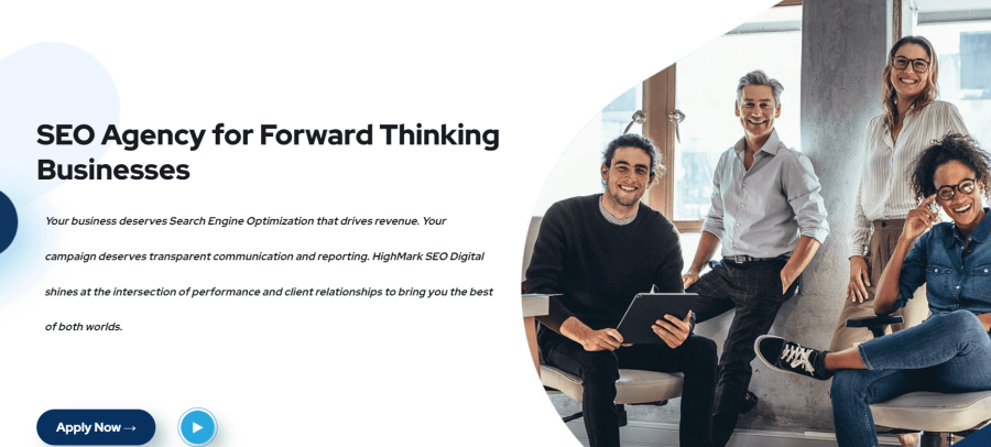
They are the top-ranking SEO company in the Midwest areas of the United States. According to High Mark SEO, they are a company that will provide you with both user satisfaction and, at the same time, generate proper revenue.
Their plan of action is pretty straightforward. First, they analyze your website to determine its quality and optimization. After that, they make appropriate changes in order to make your website more SEO optimized and increase its visibility. Next, they will power up your website by improving the trust and authority of your domain with the help of linking. This will improve your website’s performance in search engines.
Finally, the High Mark SEO team will give you a report that lets you know about any possible changes that might be needed in your campaign.
Key Highlights & Areas of Expertise:
- National & Local SEO
- Maps SEO
- Google Ads & Video SEO
- Website Design
Pricing:
There are no fixed pricing plans. A quick quote is provided after evaluating your specific needs and goals
eSputnik
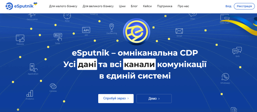
This company is based in Ukraine but provides international services. They work for startup businesses as well as large and established brands. They implement different techniques to retain visitors and convert them into returning and paying customers.
One of the perks associated with this agency is the feature of multilingualism. If you plan to expand your business to an international level, you will need to customize your web pages according to the foreign audience. In such a case, eSputnik helps you by converting a single template into other languages with minor modifications
Some other features provided by them include improving conversion frequency by sending out relevant offers, providing suitable product recommendations to visitors, and much more.
Key Highlights & Areas of Expertise:
- Audience measurement
- Media planning
- Marketing optimization
- Content meta data
Pricing:
Varying pricing for services they offer. Contact them for more details.
Heavyweight Digital
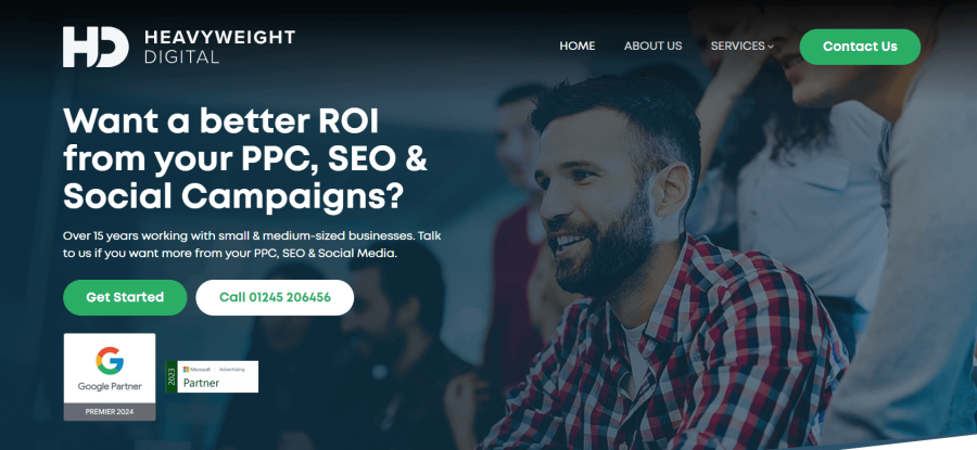
Heavyweight digital is an SEO company that assures a higher ROI (Return On Investment) from your digital marketing efforts. They specialize in helping medium-sized businesses as well as companies that are just starting out.
Their main services include Google ads, Facebook ads, web design, Microsoft ads, and click fraud protection. All of their functions are self-explanatory other than click fraud protection. Let us explain this feature in a little detail.
In a paid advertisement, you are only charged when your ad gets clicked on. If a fraudster or bot clicks on your ad, you will lose money for nothing. Heavyweight digital has specific algorithms that detect these types of clicks and restrict them and thus maximizing the efficiency of your ad.
Key Highlights & Areas of Expertise:
- White Label Services
- Tailored Web Design
- Microsoft Ads
- Content Writing
- Google Local Services Ads
- SEO
- Google Ads
- Meta Ads
- Click Fraud Protection
Pricing:
This agency doesn’t offer specific or fixed pricing plans. People can contact them to get a quote for the service they are looking to hire.
310 Creative
This digital marketing company specializes in growing sales for business-to-business (B2B) companies and companies that provide software as a service (SaaS). Their goals include refining revenue channels to the point where your marketing efforts are being utilized at maximum potential.
310 Creative also provides features such as web designing for B2B companies. This includes web maintenance to keep the site constantly optimized for their customers’ audience.
They monitor the buyer’s journey to understand the possible weak points of your campaign and strengthen them over time. These steps eventually result in a boost in sales because customer experience has been improved substantially.
Key Highlights & Areas of Expertise:
- Inbound marketing
- Sales system and strategy
- Outbound lead generation
- Revenue Operations
Pricing:
The firm offers three packages: Basic, Growth, and Enterprise. Each plan comes with different features and pricing.
STL SEO
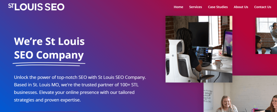
The St. Louis SEO company, as the name suggests, is another marketing agency based in St Louis. They have a collaboration with the Timmermann Group, another SEO agency. (Whose details are given above).
They provide a complete package that includes a team of professionals. These professionals may include SEO experts, designers, developers, writers, etc.
This ensures that you get all the services related to ranking higher in a search engine in one place. In addition, they go through all the factors that are affecting your ranking and then suggest changes that will provide even better results.
Like many agencies in this list, this one also strongly claims to execute an SEO strategy in a way that causes an increase in revenue for your company.
Key Highlights & Areas of Expertise:
- E-Commerce SEO
- Full-Service SEO
- Enterprise SEO
Pricing:
This agency doesn’t offer specific or fixed pricing plans. People can contact them to get a quote for the service they are looking to hire.
Balmer
Balmer Agency is based in Melbourne but has a global reach. It facilitates its customers by making online marketing as simple as possible for them. Their distinctive feature is that they provide Chinese social media marketing along with the traditional one.
Other than that, they provide basic facilities such as content marketing strategies, SEO, SEM, web design, etc. But all these services are provided by a team of experts with years of experience under their belts.
You can also take consultation with them regarding marketing plans. Through this consultation, they can guide you on how to research the market and analyze your competitors. They will help you stand out among the massive competition in the world of Saas digital marketing agency.
OllieHill SEO
The primary services provided by Olliehill SEO are organic and paid search engine marketing. Which means they can handle both SEO and SEM of your site.
They like to call their marketing strategy a white hat optimization. This implies that all the techniques used by them fall under the terms and regulations of search engines. Along with all this, they make sure to maintain the integrity of your website as well.
Similarly, they provide link-building services to make your website more authoritative. This also increases brand awareness because Olliehill only links to trusted sources and also provides a comprehensive report to let you know about these sources. This is among the many other useful features provided by this agency.
Scott Keever SEO
They are a marketing agency who have showcased some pretty interesting numbers on their website. According to them, their SEO strategy can increase about 200% of your organic traffic. These stats, along with some other services provided by them, seem very promising.
For the utmost customer satisfaction, they provide a free consultation before any paid services. This is a massive plus point as it clears out all of the user’s doubts regarding their plan of action.
Even after the purchase of their services, they give the option of monthly contracts. This means that if you are not satisfied with their work, you can cancel the subscription after a month. However, their level of confidence in their strategies gives the impression that there won’t be a need for cancellation.
Skai.io
Skai offers services that promise high user engagement and return on investment (ROI) by following a technique known as walled garden advertising. It is a form of marketing in which the services are provided to users under one platform, and the provider has complete hold over the resources.
In other words, by implementing this strategy, your goal is to become the one and only option for your customers and eliminate the competition factor. One downside of this strategy is that it is more feasible for large scaled companies.
But still, multiple small businesses have applied this strategy and gotten successful results. So, in conclusion, the approach adopted by Skai.io might be considered untraditional and controlling but still yields favorable results.
White Horse Agency
They are an agency that is not only concerned with increasing traffic but also makes sure you are getting enough conversions.
They effectively make use of all the mediums available for marketing, such as SEO, email marketing, and paid advertisements. After that, they analyze if their efforts are generating the expected results. If yes, then well and good, but if no, then they make the required changes to achieve the best results possible in terms of sales or conversions.
White horse agency also offers web development to complement all the factors listed above. This makes sure that you receive the complete package with all the available facilities.
Ad5
This marketing performance booster specializes in providing small business leads. Their methods of advertising ensure the customers that their investments are safe and will definitely generate revenue.
Their advertising also includes offering targeted deals to your audience to attract maximum traffic. This also builds loyalty to your brand and can result in returning customers.
In terms of website optimization, they believe that a website should be multifunctional. It should be able to funnel the targeted audience while providing a smooth on-site experience. For people with related queries about their website, Ad5 offers a free consultation session.
They understand all the requirements of new and emerging businesses and provide advertisement services accordingly.
Rock the Rankings
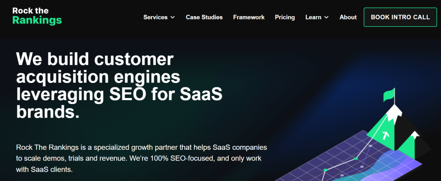
The procedure followed by this marketing agency involves connecting and guiding the audience of their customers. By doing so, they aim to reduce customer acquisition costs (CAC). In this way, you might be able to manage and save revenue from your budget.
Selecting the channels for spending money as a starter in digital marketing is a very difficult task. This agency will help you spend money on activities that actually generate growth and, in this way, work at the highest possible efficiency.
Rock the rankings claims rapid growth and immediate results. Their content writing and search engine optimization expertise help them support their claims. SEO for B2B and SaaS is one of their main strong points.
Search Media
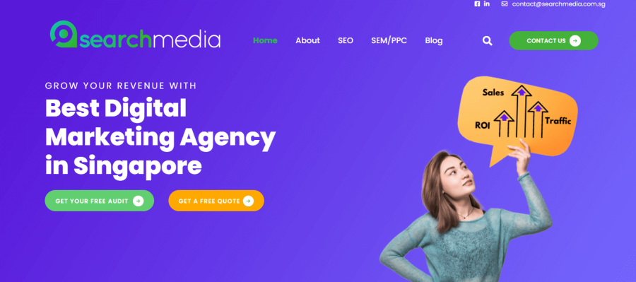
This Singapore-based digital marketing company can help you digitize your existing business. For new customers, they offer a free audit report to let them get an idea of their SEO’s standing.
In this way, you become aware of whether your SEO requires modification or not. In the latter case, Search media gives you the option to let them handle it for you.
Organic search visibility and paid search engine marketing are the only two main services provided by this company. In order to perform these activities, they make use of fine online tools such as Ahrefs and SurferSEO.
This agency could be a good option for people who need an initial push to enter the world of digital advertisement.
Solar Winds
This platform provides tools for monitoring and protection. They have had customers who saved substantial amounts of money by using their tools instead of the traditional ones. Their platform offers several different services that will help you throughout your whole digital marketing journey.
Solar winds provide management toolkits such as network management that resolve problems with the help of traffic intelligence. Similarly, services like database and systems management are available that provide further aid to your marketing cause.
Their products are efficient in terms of security as well. They make sure your data is well protected from any possible threats or attacks.
Technology Advice
Technology advice helps users that are interested in buying tech items or software reach your brand. In terms of marketing solutions, they don’t make any flashy claims and stick to the basic routine.
They start with creating compelling content for a specific audience and then gradually build up awareness for your brand. Finally, they convert visitors into engaging and paying buyers.
They have a direct audience to whom they can connect you and make the advertising part a bit easier. This audience is not confined in any way but is a diverse group that is spread worldwide and can purchase your tech-based products and services.
Tip Top SEO
This SEO agency helps its customers to spend their resources in the most efficient manner in order to grow their business. They have showcased some of their previous works on their website, according to which they were able to make their customer’s site rank number 1 for a particular keyword.
Your website visitors need to be converted into revenue-generating streams. Tip top SEO takes measures to make sure that happens.
Their strategy also includes making use of retargeting techniques, which funnels your users from the past right back to your content and increases the chances of sales. This improves your pay-per-click rates.
Anita T: Digital Marketing
This marketing agency paves your marketing journey by using all the mediums for marketing. This includes social media, email marketing, conversion rate optimization, etc.
They mainly focus on smaller businesses and help them grow into recognized brands. They design your company and the user experience that comes along with it.
Anita T starts modifying your marketing channels by understanding the market that you are going to focus on and then takes steps to solidify your successful strategies. Once that is done, they amplify your channels to get you maximum benefits.
You can consider this marketing agency is you are new to the online market and looking for easy solutions.
Noop
This digital marketing agency provides a mix of services with the main goal of understanding your audience and providing what's best for them. They make use of some unique strategies to fulfill their task.
They make sure that all marketing steps are taken at an appropriate time by evaluating the competitor market. Similarly, they streamline your work plan, which can take your business to the next level. The marketing strategy used by Noop also includes minimizing all the factors that might be limiting your business potential.
Their marketing strategy has been used by quite a few renowned international brands. So, this agency might be a good option for those of you who are working on a relatively bigger scale as compared to start-up businesses.
United SEO
USEO is a marketing company based in Dubai and specializes in marketing businesses from Dubai. This is because they have a better understanding of the business nature in their area. They have partnered with many renowned brands from there, as have been showcased on their portfolio.
They claim to have a result-based marketing strategy. This can be done by deeply understanding the nature of their customer’s business and their audience.
Other than traditional SEO services, they also provide social media marketing that includes a section designed specifically for Instagram. This improves your user engagement rates and consequently helps in tailoring an audience-specific marketing strategy.
Digital Sisco
This is a digital marketing agency that is not only focused on getting their customer’s businesses ranked in a search engine but also makes sure that their content reflects the customer’s brand.
Their plan includes segmenting the marketing journey into small steps such in which the initial steps are relatively easier such as keyword research and the in the later steps things start to get technical such as audits as backlink building.
This agency can be a good pick for users who are more concerned about creating a distinct and unique image among their online competitors, as Digital Sisco provides great services in that regard. However, this does not mean that their SEO facilities in terms of getting ranked are flawed.
Their portfolio consists of many satisfied customers whose traffic numbers have increased by following the marketing strategy provided by Digital Sisco.
Yeah Local
Their website’s landing page makes a bold claim that they can get your business to dominate the first page of Google search results. Their SEO strategy has been used in multiple industries, and they are open to expanding this pool of industries.
They offer a free audit report about your SEO performance. This report points out the areas of your SEO strategy that require changing, and if you avail of their services, these changes will be made by the agency.
Yeah Local’s only focus is to substantially increase your ranking and resultantly flood your website with a large number of users. Their strategy sounds like they are only concerned with quantity. However, this strategy has worked for many businesses. So, if you want to increase the number of people visiting your site, then this marketing agency is for you.
Digitopia
Digitopia is an online marketing agency that helps business-to-business companies to improve their traffic metrics with the help of a strategy that they call the “Digital Utopia Methodology.”
This method is based on inbound marketing, which is a strategy that is focused on content that is tailored according to the needs of one’s target audience. In other words, an inbound marketing strategy involves the conversion of site visitors into long-term customers. Additionally, they are also diamond-tier HubSpot partners, which is a platform that is also focused on inbound marketing.
Their strategy claims to assure an adequate return on investment with the help of long-term buyers. The partnership with a large-scale and powerful platform such as HubSpot is really a plus point for this agency. So, if you are skeptical or unsure of the credibility of online marketing agencies, Digitpoia can be a safe pick.
NJ Advance Media
They are local news providers, along with being a digital marketing agency. This keeps them aware of all the latest developments in the online marketing world.
NJ Advance Media provides digital marketing services that are segmented in terms of industries or the nature of your business; for example, their strategy for healthcare marketing is different from the strategy used in automotive marketing.
In this way, they don’t have a single marketing plan. Instead, their marketing efforts are targeted at specific industries.
Additionally, they also publish blogs and articles about the latest marketing trends. These posts can provide you an insight into what should be your next step in your digital marketing journey.
Growmeo
This is a unique marketing agency that makes use of Artificial Intelligence technology to manage your SEO and generate a higher pay-per-click rate.
The majority of marketing companies online are based on manual work by actual people. This is a decent approach as humans can understand the needs of their customers accurately. However, in today’s world, where almost every industry is using AI-driven technologies, it is only logical to use AI in digital marketing campaigns.
This agency is not completely dependent on machines to perform its function. In fact, they have actual people that will understand your requirements. But after that, most of their process is AI-based. This gives quick results, such as higher traffic and pay-per-click rates.
Zion And Zion
Marketers at Zion and Zion understand your business and devise a marketing plan that facilitates the users of their customers and simultaneously generates revenue.
They repeatedly assure that the team assembled for their customers will structure a digital marketing campaign that is highly personalized according to their business nature. Moreover, they claim to be using high-end technologies to provide maximum results.
One impressive thing that we found about them is that they are partnered with a few very popular international companies. This raises the question of whether this agency only specializes in large-scale and established businesses. It is very unlikely that this be the case because their promises of personalization of marketing campaigns don’t generally apply to such large-scale businesses.
Single Grain
Their main plan is based on minimizing the customer acquisition cost. This means their strategy lets you get more customers without spending money unnecessarily. They claim to locate the most profitable mediums that can generate better results at a lower price.
Single Grain achieves this by catering a marketing strategy in which they study all your strengths and focus solely on those strengths. This strategy lets you get a prominent spot among the vast number of competitors online.
They also provide learning facilities in which you can study various marketing strategies to strengthen your SEO plan and progress in the online market.
They also claim to use the same innovative strategies for you that they have used for ranking their own website on Google.
Bambrick
They are a marketing agency based in Brisbane. Their services are kind of limited to users in Australia or, more specifically, to users in Brisbane. They claim to be the best marketing company in that area.
Their strategy is said to improve all the factors that are affecting your SEO campaign. This includes higher return on investment, higher conversion rates, and much more. A few major services that are included in their plan are SEO, Google ads, conversion rate optimization, and social media marketing.
For new customers, however, a 60-minute free strategy session is available that discusses all these aspects briefly to let users decide whether they want Bambrick marketers as their marketing agents or not.
Yum Yum Videos
This is a video production company that provides its services to all types of businesses ranging from recent startup businesses to big established companies.
Video marketing is arguably one of the best ways to promote a product or service online. However, not everyone has the resources or skills to produce a high-quality video. Yum Yum Videos has created a platform where users can let professionals handle the technical aspects of creating a video.
They have different sections according to the type of video. A few examples of these sections are commercial videos, educational videos, or social media videos. There are many other options as well. So, based on the nature of your business or the product that you are going to market, you choose what type of video would be the best fit.
Akveo
Software engineering services for digital marketing purposes are provided by Akveo. It is very likely that a point in your business marketing strategy will come where you need an app for promoting your products.
A set of software engineers are required to develop such an app. This agency has such a team of engineers. A few industries for which they specialize in terms of creating apps are education, e-commerce, finance, and a few more. If your business is a part of such industries, then you can consider them to develop an app for you.
Along with app development, they also provide web development services because, usually, the format or design of a website and its app are similar.
On the Map
On the Map is an agency for Internet marketing that provides multiple services for an improved online presence. Their services are segmented into different sections, such as Local SEO and E-commerce SEO.
You can choose the service that fits your needs the best and then select a plan based on the level of marketing that you need. For example, within the E-commerce SEO, there are 3 different plans, namely small, medium, and large E-commerce. So, we can say that there is a large variety of options for businesses of all scales.
They also have a section for the types of industries in which they offer their services. These include law firms, dentistry, e-commerce companies, home services, and a few more. In addition to all these options, they also offer a free SEO audit to prove their expertise and help your business.
Dietz Group
It is another digital marketing agency that is focused on growing the digital presence of businesses with the help of a compelling web design and improved SEO. They promise a return on investment if you partner with them in the form of paying customers.
They offer a wide variety of services such as Google PPC ads, content management, Bing ads, and much more. And the web development services include mobile-friendly sites, responsive designs, managed hosting, etc.
A unique feature of their content marketing strategy is that they focus more on the metrics that can help you grow your business. They help their users identify such metrics and work to improve those particular metrics exclusively. This is how they try to make the most out of their online marketing strategy.
Serpline
This is a platform where you can improve your SEO skills or learn about it from scratch. This platform does not provide marketing services but instead provides educational services in the form of lessons on SEO.
They have an extensive list of regularly updated blog posts that include the latest about SEO and content marketing. Similarly, users are given the option to sign up for their email newsletter, which keeps them updated on the latest trends via email.
By using the above-mentioned mediums for SEO advice, you can learn how to structure your digital marketing campaign and get desired results in the form of things such as improved conversion rates or higher ranking in a search engine.
Impressive Digital
This Austin-based digital marketing company specializes in marketing businesses all across the United States. This agency is focused on metrics such as increasing traffic and conversion rates.
In addition to that, they also provide services that let users retain their growth. Or in other words, they maintain the growth instead of providing a one-time marketing service.
Similarly, because of the number of different options available to online users, Impressive Digital makes sure that your business’s customer relationship management is structured in such a way that users select your site from this large number of options.
In simpler words, they focus mainly on building customer loyalty to maximize results.
Ad espresso
They are an advertising agency that lets its customers find a suitable audience to show ads. Their platform provides all the necessary tools that a user might need throughout their journey of advertising.
They provide ad management services for Instagram, Facebook, and Google ads. Using this platform, you can create an advertising plan or campaign and set it in motion. After that, you can manage this campaign and make appropriate changes over time to keep your campaign as optimized as possible.
Ad Espresso provides different pricing plans for different types of businesses. These plans provide different features. These plans are sectioned as starter, plus, and enterprise. Even though the names of these plans indicate the type of business for which they are suitable, you can still check the details to determine which plan will work for your business.
Top Range Technologies
This is a digital marketing platform that provides various tools that can help you in your digital marketing strategy. These include tools for web design, SEO, Pay-Per-Click ads, social media management, etc.
Top Range Technologies have mentioned a few main types of websites that they cover in terms of development. These include informational, small business, e-commerce, and blog websites. So, if your business requires a similar website and you want to optimize its design as well as its ranking in search engines, you can try out this marketing agency’s services.
As an additional service, they also provide guides for fixing computer issues, such as viruses, as you might encounter them during your online marketing journey. Similarly, you might come across a situation where you have accidentally lost valuable data. The recovery of such data is also possible with the help of their computer repair tool.
Digital
Digital is a platform that provides a large number of services for improved web design. They have a number of different blogs that explain tools that help users create a website that fits all of their requirements.
The good part is that in order to use these web developing tools, you don’t require any sort of prior knowledge about coding or programming.
The same is the case with e-commerce sites. You can create them with the help of tools mentioned by the guides on Digital without any experience in coding. With the help of these websites, you can set up your product pages and sell your products or services online.
So, we can define this platform as a network of articles or blogs that can guide you throughout your digital marketing journey.
South Lakes SEO
This is a consulting agency where you can get advice for your marketing strategies. They promise careful attention to detail when it comes to your SEO plan. Their portfolio clearly states that your business will be handled as if it was their own.
This assures that the consultancy that you receive is tailored exactly according to the nature of your business. This SEO advice can help you grow your business in terms of traffic and revenue and ultimately create a powerful online presence.
Other than advice, Southside Lakes SEO can also do your work for you. This includes understanding your business through a detailed chat, creating a plan fitting for your business, and then implementing this plan to improve your number.
Keyword Hound
The use of appropriate keywords is one of the main factors that decide the ranking of your website on a search engine result page. However, there are some strategies that you need to implement in order to get maximum results. These strategies are provided by Keyword Hound for their users.
It isn’t as simple as finding out keywords that are favored by search engines and making them a part of your content. This agency, after proper research, lets its users know about the most effective ways in which these keywords can be used.
One of the steps that they implement for improved SEO is making use of the keywords used by your competitor’s website. In this way, you can have a presence greater than them.
From The Future
FTF is a digital marketing agency that aspires to build long-term relationships between its users and their customers. This results in revenue growth or an increase in conversion rate.
All their strategies are based on data collected through research. They make sure that no step is taken without cause. They offer full-fledged performance plans for their customers to let them get to understand the flaws in their campaign and then suggest suitable changes.
Some other techniques used by them include segmenting your audience into distinct groups and optimizing your site for all these groups differently. Such steps greatly improve user experience and, as a result, create a successful online business.
Caffeine Marketing
They are a local marketing agency that is based in the United Kingdom. You can either use their services to get a thorough strategy, or you can give them access to your online business so that they can improve your SEO.
In addition, you can use their services for web design, social media marketing, content management, and paid advertisement management.
There is a large list of industries that this marketing agency can cover. Your business can be e-commerce related, or it can be about sports or entertainment purposes. Caffeine Marketing will create a strategy that fits the needs of your business.
Marketing Insider Group
If your online business requires you to update your site with new content constantly, then you can consider Marketing Insider Group. They are a marketing agency whose online marketing plan consists of publishing new content around twice a week.
To be more specific, this regularly updated content constitutes written work such as articles or blogs. They go through all the necessary steps, such as audience research, the creation of a goal-based strategy, and content optimization for improved SEO.
After the content has been published, they monitor and optimize things like click-through rates to maximize organic traffic. Some very famous brands have used their services for content creation and management, even though they are a relatively small marketing company.
SEO Pressor
It is an online marketing agency that manages WordPress sites. WordPress is a website hosting service that is widely used around the world. Because of a few dissimilarities between these sites and normal sites, SEO Pressor has created a platform whose SEO services are specifically designed for wordpress sites.
They generate detailed reports based on the performance of your website and provide suggestions for their users.
If you want more than just suggestions, they provide practical services as well. Their strategy is to optimize your content to rank for at least 3 keywords. You can use their keyword-related tool for this purpose.
Similarly, these tools also let you know if your content is machine-readable or not. This is very important as this enables the search engine to find your work and determine if it is relevant to a certain query.
Digital Third Coast
They are a marketing company that increases your online visibility with the help of extensive audience research along with other strategies. They can manage both organic searches as well as paid advertisements, also known as search engine marketing.
Their portfolio consists of amazing statistics, such as a 703% increase in purchases with the help of Facebook ads for one client and 4 times increased visibility for another. Additionally, they have also showcased multiple awards that they have achieved over time. These factors really contribute to the fact that this agency is credible.
Other than the services mentioned in the beginning, they are also capable of managing your social media marketing. A mix of all these services results in a greatly optimized digital marketing campaign that is very likely to produce desired outcomes.
Superb Digital
Superb Digital is a digital marketing company that also offers a downloadable SEO forecaster. This can help you monitor your SEO performance with the help of an application.
Other than that, they provide services for web design and pay-per-click management as well. Their strategy is said not to be a one size fits all approach. Instead, it claims to tailor your marketing campaign that is unique to your business and your business only.
The main focus of Superb Digital is manufacturing businesses, and even in such a specific industry, they treat their clients according to their specific needs. They believe that all manufacturers are different from one another in some way.
Furthermore, their level of experience is kind of hard to find these days as not all marketing agencies have been in working for more than 20 years.
Digital Pigeon
Digital Pigeon is an online platform that allows companies to transfer files with ease. Many online businesses require sending or receiving content at specific times. This platform helps those types of businesses.
For example, publishing text or visual content can be done with the help of this site. They guarantee the security of your files. Similarly, they also offer the transfer of large-sized files with ease.
As an additional feature, this platform also provides services relating to customer feedback. You can get detailed feedback from your customers that help you get insights into what your audience thinks about you so you can optimize your content according to their needs.
All their services are tracked, and you are kept informed about your files or content’s stauts at all times.
Net Local
Net Local is a marketing agency for small-scale businesses that want to compete in the local market. This agency provides both consulting and personal service. This means you can choose between them suggesting you the next steps in your marketing campaign or let them do your work for you and get reports after regular intervals.
Their sole focus is to make their client’s website rank on local SEO. This unique approach can help you rank higher than your competitors or have higher sales than them. Your business will be displayed in local listings as well as in the search results.
Additionally, their services can also help users expand their business’s reach in terms of its geographic spread so that it reaches an audience that is located farther away as compared to its current audience.
Articulate
This marketing agency compels its users to create a distinct identity for their brand with the help of various marketing strategies, such as a unique web design to differentiate themselves from their competitors.
Other than web design, these strategies can help you with the choice of words in your content that would best resonate with the needs of your audience. There are different tools available to perform these tasks.
These tools give you access to all the study material that you need to improve in that area. For example, if you select the web design tool, you will be given access to all the guides, e-books, articles, etc., that you need for optimizing your site’s design.
Similarly, you can sign up for Articulate’s email newsletter to get the news about the latest trends.
Social Buddy
It is social media focused marketing agency that improves your numbers on platforms such as Instagram. It is not one of those platforms that scam users by adding bots to their followers and claim to have improved their numbers. These bots are of no help in promoting a product or service.
Social Buddy, on the other hand, targets real people that might be interested in your business. This will give you a new set of audience with whom you can interact and fulfill their needs.
Their strategy involves targeting the audience of your competitors because they are the most probable to be interested in your work. Similarly, as you might already know, the use of hashtags can be a huge help in terms of increasing traffic. That’s why using such hashtags is also a part of their social media marketing strategy.
Ardor SEO
Ardor SEO is a marketing company that helps you to focus more on running your business instead of getting caught up in handling a website. They can optimize your website in such a way that it provides the best user experience and also ranks well on the search engine.
According to Ardor SEO, online marketing requires a ton of resources if not planned correctly. By using their services, you can market your content in the most effective way possible with the least possible investment.
A few specific industries for which this agency provides marketing services are real estate and law. Other businesses can also be marketed with the help of this platform, but these two have a separate section.
List Of Other Useful Resources
Search Engine Journal (SEJ)
Search Engine Journal (SEJ) is not primarily a digital marketing agency. Instead, it's a reputable online platform that specializes in educating and informing its audience about the latest trends, updates, and best practices in the realm of search engine optimization (SEO), digital marketing, and the broader online marketing landscape. Founded in 2003, SEJ has grown to become a leading authority in the digital marketing industry, offering insights from experts, in-depth articles, webinars, and conferences. While it does provide resources and tools that digital marketers find invaluable, its primary role is as an educator and news outlet rather than a traditional digital marketing agency.
Newswire.com
Newswire.com is a press release distribution platform that offers businesses a comprehensive suite of tools and services to effectively communicate their news and stories to a broad audience. Serving as a bridge between companies and the media, Newswire.com ensures that announcements reach not only journalists and news outlets but also stakeholders, influencers, and the general public. With a focus on maximizing visibility and ROI for its clients, Newswire.com stands out as a go-to solution for businesses aiming to amplify their message in the digital age.
Backlinko.com
Backlinko is a leading online platform founded by Brian Dean, renowned for offering actionable search engine optimization (SEO) and digital marketing advice. The website stands out for its in-depth guides, case studies, and research-driven content, which is geared towards helping marketers, business owners, and SEO professionals achieve higher rankings in search results. Brian Dean's unique approach to "skyscraper" content and his emphasis on quality over quantity has made Backlinko a trusted resource for advanced SEO techniques and strategies in the digital marketing landscape.
Blockchainaustralia.com.au
Blockchain Australia is the premier blockchain development and consulting firm in the country, standing at the forefront of technological innovation. With a deep commitment to transforming emerging tech ideas into tangible solutions, they have carved out a niche as the go-to experts for those seeking to navigate the intricate landscape of blockchain technology. Their mission is straightforward yet profound: to transform visionary tech concepts into fully functional realities. Leveraging their expertise, businesses across Australia can confidently step into the future, harnessing the immense potential that blockchain technology offers.
Business.com
Business.com is a comprehensive platform tailored for entrepreneurs, business professionals, and decision-makers, providing invaluable insights, tools, and resources for all facets of running and growing a business. Renowned for its expertly curated content, the site covers a wide range of topics, from starting and financing a business to marketing, operations, and leadership best practices. Through its in-depth articles, reviews, and advice from industry experts, Business.com serves as a trusted guide for businesses navigating the challenges and opportunities of the ever-evolving corporate landscape.
wikihow.com
WikiHow is a widely recognized online platform dedicated to providing clear, step-by-step guides on how to do just about anything. Boasting a vast collection of tutorials, the site covers a diverse array of topics ranging from everyday tasks to more niche activities. Crowdsourced from a global community, wikiHow articles often feature illustrative images and are peer-reviewed to ensure accuracy and comprehensibility. Its mission is simple: to empower everyone, everywhere, to learn how to do anything, making knowledge accessible and practical for its vast readership.
Quora.com
Quora is a popular question-and-answer platform where users can pose questions, provide answers, and share knowledge on a vast array of topics. Rooted in a collaborative spirit, Quora allows individuals from all walks of life, including experts in various fields, to contribute insights and perspectives, making it a rich source of authentic information and diverse viewpoints. With its user-driven content, the platform fosters a community of continuous learning, curiosity, and meaningful discussions, bridging the gap between those seeking answers and those with the knowledge to provide them.
Neilpatel.com
NeilPatel.com is the digital hub of Neil Patel, one of the most influential figures in the online marketing industry. Renowned for his expertise in search engine optimization (SEO) and digital marketing strategies, the site offers a plethora of resources, including articles, videos, podcasts, and tools, tailored to help businesses grow online. From in-depth guides to the latest marketing trends, NeilPatel.com has become an indispensable resource for marketers, entrepreneurs, and businesses aiming to boost their online presence and achieve measurable results.
Tomedes.com
Tomedes is a professional language and translation service provider that has been connecting businesses and individuals with expert linguists for over a decade. Offering services in a wide range of languages and specialties, from document translation to website localization, Tomedes prioritizes accuracy and cultural sensitivity. With a global network of skilled translators, the company is dedicated to ensuring clear and effective communication across borders, making it a trusted choice for diverse translation needs in an increasingly interconnected world.
Turbologo.com
Turbologo is an intuitive online logo design tool tailored for businesses and individuals seeking a quick yet professional branding solution. With a user-friendly interface, the platform guides users through a streamlined design process, producing high-quality logos based on preferences and inputs. Whether you're a startup in need of an initial brand identity or an established entity seeking a refresh, Turbologo offers an efficient and cost-effective way to craft distinctive logos without the need for extensive design experience.
Writix.com
Writix.com is an online academic writing service tailored to support students in their educational journey. Offering a suite of services, from essays and research papers to coursework and dissertations, Writix connects students with seasoned writers who deliver bespoke written content. With a commitment to originality, quality, and timeliness, Writix.com positions itself as a dependable ally for students aiming to excel in their academic pursuits while alleviating the stress of tight deadlines and complex assignments.
Localenterprise.ie
Local Enterprise Offices (LEO) operate under the domain localenterprise.ie and serve as Ireland's primary support network for small businesses. Established to stimulate economic growth and entrepreneurship, LEO offers guidance, training, mentoring, and financial assistance to startups and small businesses throughout the country. With offices across all Irish counties, LEO acts as a first-stop shop for entrepreneurs and businesses seeking advice and resources, ensuring they have the necessary tools and knowledge to thrive in their respective markets. Through its tailored services, LEO plays a vital role in fostering local innovation and job creation.
DoMyWriting.com
DoMyWriting.com is an online academic writing service dedicated to assisting students with their writing needs. Catering to a wide range of academic levels and subjects, the platform connects students with professional writers who provide custom-written essays, research papers, and other academic assignments. With a focus on delivering quality, original content within stipulated deadlines, DoMyWriting.com aims to be a reliable support system for students seeking help with their academic workload, ensuring they meet their educational goals.
Britishcouncil.org
The British Council is the United Kingdom's international organization for cultural relations and educational opportunities. Established in 1934, its mission is to build connections, understanding, and trust between people in the UK and other countries through arts and culture, education, and the English language. Operating in over 100 countries, the British Council offers a vast range of programs, including English language teaching, arts exhibitions, educational exchanges, and academic opportunities. As a beacon of British culture and values, the organization plays a pivotal role in fostering international collaboration and cultural diplomacy.
Postplanner.com
Post Planner is a robust social media management tool designed to help brands, businesses, and individuals supercharge their content strategy and posting schedules. With features that allow users to discover, plan, and automate their social media content, Post Planner aims to drive more consistent engagement and growth across platforms. Built on the premise of making social media marketing simpler and more effective, the platform offers a suite of tools that help users find high-performing content, streamline their posting calendar, and achieve better results with less effort.
Crowdspring.com
Crowdspring is an innovative online platform that connects businesses with a global network of creative professionals to source custom designs and branding solutions. Whether it's logo design, packaging, web design, or any other creative need, Crowdspring offers a unique crowdsourcing approach, allowing clients to receive multiple design concepts and then choose their favorite. By democratizing the design process, Crowdspring provides an affordable and efficient way for businesses of all sizes to access high-quality creative work while also offering designers worldwide opportunities to showcase their talents and earn.
iconscout.com
Iconscout is an extensive digital design resource platform, providing a wide variety of high-quality icons, illustrations, 3D elements, and Lottie animations. Catering to designers, developers, and businesses alike, Iconscout offers both free and premium assets to enhance visual projects and presentations. With its user-friendly interface and a rich collection contributed by a global community of talented designers, Iconscout has become a go-to destination for those seeking diverse and top-notch design elements for their digital needs.
Harimenon.com.au
Hari Menon Digital, based in the vibrant heart of Sydney, stands as a premier Web Design & SEO agency, dedicated to amplifying the online presence of small businesses, organizations, and individuals. With over half a decade of expertise spanning Web Design, SEO, Social Media Marketing, and more, this agency, founded by the seasoned entrepreneur and SEO expert, Hari Menon, has a distinguished track record of delivering sophisticated web and mobile solutions. Beyond his agency's accomplishments, Hari, with academic credentials in Computer Science and Information & Communications Technology, has been a pivotal figure in the digital realm since 2012, launching successful websites across various niches and establishing his mark as a leading digital strategist in Sydney.
Bloggingbasics101
BloggingBasics101 is a comprehensive resource platform dedicated to helping beginners navigate the world of blogging. Offering insights, tutorials, and best practices, the site delves into the essentials of starting, maintaining, and growing a successful blog. From technical aspects like setting up a domain and hosting to content creation and promotion strategies, BloggingBasics101 serves as a one-stop guide for those eager to step into the blogging realm and make their mark in the digital space. Its user-friendly approach and actionable advice make it a go-to reference for budding bloggers.
Huffpost.com
HuffPost, formerly known as The Huffington Post, is a prominent digital news and opinion platform known for its diverse content that spans politics, business, entertainment, environment, technology, and more. Founded in 2005 by Arianna Huffington, Kenneth Lerer, and Jonah Peretti, HuffPost quickly rose to prominence and became a significant voice in the online media landscape. With its mix of original reporting, blogs, and aggregated content, HuffPost offers readers a blend of in-depth features, commentary, and breaking news, serving as a trusted source for millions globally.
Magenet.com
Magenet is an online platform that connects website owners with advertisers, facilitating the monetization of websites through contextual advertising. By offering a marketplace where website owners can list their sites and advertisers can find relevant places to display their content, Magenet simplifies the process of acquiring and selling online ads. With a focus on transparency and efficiency, the platform aims to ensure that both publishers and advertisers derive maximum value from their online assets and campaigns, making digital advertising more streamlined and effective.
Linksmanagement.com
LinksManagement is a specialized platform that focuses on providing SEO services, particularly in the realm of backlink acquisition. Aimed at improving a website's organic rankings, LinksManagement offers website owners and digital marketers access to high-quality, relevant backlinks from authoritative sources. By streamlining the process of obtaining and managing backlinks, the platform ensures that users can efficiently enhance their site's SEO profile, increasing visibility and traffic. With its user-friendly interface and a vast network of potential link placements, LinksManagement has established itself as a trusted tool in the SEO community.
Usabilitygeek.com
UsabilityGeek is an online platform dedicated to topics at the intersection of usability, user experience (UX), and digital design. Serving both professionals and enthusiasts in the field, the website provides insightful articles, guides, and best practices to improve website and product usability. From in-depth tutorials on interface design to discussions on the latest UX trends, UsabilityGeek offers valuable content for designers, developers, and businesses aiming to enhance user satisfaction and engagement with their digital platforms. With its focus on creating user-friendly digital experiences, the site has become a go-to resource for all things usability and UX.
Tinypng.com
TinyPNG is an online tool designed to optimize and compress PNG and JPEG images without sacrificing their visual quality. By reducing the file size of images, TinyPNG helps websites load faster, ultimately improving user experience and conserving bandwidth. With its simple drag-and-drop interface, users can easily upload and compress their images, making it an essential tool for web designers, developers, and anyone keen on optimizing their web content. Beyond its web interface, TinyPNG also offers plugins and API integration for automated workflows, solidifying its reputation as a trusted solution for image optimization.
Customessaymeister.com
CustomEssayMeister is an online academic writing service that offers custom-written essays, research papers, theses, and other academic assignments for students. Catering to a broad range of academic levels and subjects, the platform prides itself on delivering original content tailored to individual client requirements. With its team of professional writers, CustomEssayMeister aims to assist students in navigating the challenges of academic writing, ensuring they meet their educational objectives while adhering to academic integrity standards.
Boosted.lightricks.com
Boosted by Lightricks is a user-friendly platform designed to empower businesses, influencers, and individuals to create captivating video content for social media marketing. Boosted is part of the Lightricks family, known for its suite of creative apps. It offers a range of customizable video templates, tools, and features to produce professional-quality videos even without prior design experience. With its focus on aiding users to boost their online presence and engage their audience effectively, Boosted has emerged as a go-to solution for those looking to elevate their digital marketing and storytelling efforts.
Hubspot.com
HubSpot is a leading inbound marketing, sales, and service platform designed to help businesses attract, engage, and delight customers. Founded in 2006, HubSpot has revolutionized the way companies approach marketing with its comprehensive suite of tools that encompass content management, email marketing, customer relationship management (CRM), and analytics. With its philosophy centered around providing value and building trust with customers, HubSpot champions the inbound methodology, aiding businesses to grow organically by creating meaningful and lasting relationships with their audience. With educational resources, certifications, and a robust software platform, HubSpot remains a pivotal figure in the modern digital marketing landscape.
Ahrefs.com
Ahrefs is a renowned toolset for SEO and digital marketing, widely recognized for its extensive backlink index and robust suite of SEO tools. Providing insights on website performance, competitor analysis, keyword research, and more, Ahrefs is a favorite among marketers, SEO professionals, and businesses aiming to optimize their online presence. Its platform offers features such as Site Explorer, Keywords Explorer, and Content Explorer, which together provide comprehensive data and analytics about a website's position in the digital landscape. With its commitment to accuracy and a user-friendly interface, Ahrefs stands as one of the premier resources in the SEO community.
Title-generator.com
Title Generator is a tool commonly used by content creators, bloggers, and digital marketers to generate catchy and relevant titles or headlines for their content. By inputting keywords or a topic into the generator, users receive a list of potential titles that can grab the attention of readers and improve click-through rates. Such tools harness algorithms and databases of proven headline formulas to offer multiple suggestions, streamlining the content creation process and enhancing the appeal of articles, blogs, ads, or any other type of content. If you're referring to a specific "title-generator" website or platform, you might need to provide more details or check their official site for a more accurate introduction.
Fiverr.com
Fiverr is a global online marketplace that connects businesses with freelancers offering a vast array of digital services. Launched in 2010, the platform gets its name from the original model where services were offered at a base price of $5. Over the years, Fiverr has expanded to encompass a wide range of categories, including writing, graphic design, programming, video editing, and more. With its easy-to-use interface, buyers can browse through gig listings, view portfolios, and hire freelancers based on their needs and budget. Similarly, freelancers, or "sellers," can showcase their skills, set their pricing, and offer packaged services. Fiverr's emphasis on democratizing the freelance economy has made it a popular choice for businesses and freelancers alike, streamlining the process of buying and selling digital services across the globe.
Smartblogger.com
SmartBlogger is a comprehensive online platform dedicated to helping writers and bloggers elevate their craft and monetize their content. Founded by Jon Morrow, a recognized authority in the blogging world, SmartBlogger offers a treasure trove of resources, including in-depth articles, courses, and coaching, all designed to guide aspiring and established bloggers towards success. Covering topics from content creation and promotion to building an audience and generating income, SmartBlogger stands out as a trusted guide in the ever-evolving landscape of online writing and content marketing.
Investopedia.com
Investopedia is a leading financial and investment education website that offers a vast repository of information on finance, investing, and economic concepts. Since its inception in 1999, Investopedia has been dedicated to simplifying complex financial information and advice, ensuring that readers have the resources and knowledge to make informed financial decisions. With its extensive range of articles, tutorials, dictionaries, and financial calculators, Investopedia serves both novices and professionals looking to understand the intricacies of the financial world. Over the years, it has established itself as a trusted and authoritative source for financial information on the web.
Mangomattermedia.com
MangoMatter is a Brisbane-based full-service web agency established in 2013 that has rapidly grown into a trusted name in the digital realm. While they offer an array of services, they notably specialize in testing and reviewing web themes, hosting solutions, and WordPress plugins. What began as a modest venture saw a significant surge in demand around April 2013, particularly for their web design and SEO services, propelling them to expand and cater to the evolving needs of their clientele. With a commitment to quality and innovation, MangoMatter continues to provide tailored digital solutions for businesses and individuals alike.
Entrepreneur.com
Entrepreneur.com is the digital counterpart of Entrepreneur magazine, a leading source of information and news for business owners, innovators, and aspiring entrepreneurs. Established decades ago, the platform has become synonymous with business insights, startup advice, and inspiring entrepreneurial stories. Covering a wide range of topics, from business trends and marketing strategies to leadership advice and franchise opportunities, Entrepreneur.com provides valuable resources for individuals at every stage of their entrepreneurial journey. Its content aims to inform, inspire, and challenge business professionals, making it a must-visit destination for those looking to navigate the dynamic world of entrepreneurship.
Herzing.edu
Herzing University is a private, non-profit institution that offers a range of degree programs catering to both traditional and non-traditional students. With campuses across multiple states and a robust online platform, Herzing is committed to providing accessible, career-focused education programs in fields such as nursing, technology, business, and healthcare. Established in 1965 as a computer training institute, the university has since expanded its offerings and now provides diplomas, associate, bachelor's, and master's degree programs. With its student-centric approach and a mission to empower individuals to achieve their career goals, Herzing University has become a recognized name in higher education.
Harvard.edu
Harvard University is one of the world's most prestigious institutions of higher education. Established in 1636, it is located in Cambridge, Massachusetts, and stands as the oldest institution of higher education in the United States. Boasting a rich history and an enduring legacy, Harvard is renowned for its rigorous academic programs, groundbreaking research, and a diverse community of scholars and learners from around the globe. Home to multiple graduate schools, including the renowned Harvard Business School, Harvard Law School, and Harvard Medical School, the university consistently ranks among the top academic institutions globally. Harvard's vast alumni network includes numerous influential figures in various fields, further solidifying its reputation as a center of excellence and intellectual leadership.
Web.colby.edu
Web.colby.edu is associated with Colby College, a private liberal arts college located in Waterville, Maine. Founded in 1813, Colby College is one of the oldest liberal arts colleges in the United States and is known for offering a rigorous academic program in a close-knit community setting. The institution emphasizes interdisciplinary learning, global understanding, and research opportunities for its students. While I don't have real-time, specific details about the "web.colby.edu" subdomain, it's likely related to specific departments, projects, or individual pages affiliated with Colby College. Visiting the site directly would provide the most accurate details for specific content or information from this domain.
Depositphotos.com
Depositphotos is a global stock photography, graphics, and video platform that caters to designers, businesses, and media outlets. Founded in 2009, it offers a vast collection of high-quality and royalty-free photos, vectors, illustrations, and videos, sourced from contributors around the world. With an intuitive search system and a diverse range of content, Depositphotos has become a go-to resource for visuals, assisting creatives and professionals in enhancing their projects and marketing materials. Its comprehensive library and flexible pricing models make it a favorite among users looking for both inspiration and tailored visual solutions.
Techtarget.com
TechTarget is a leading online technology media company that provides detailed content and targeted marketing services for tech professionals. Established in 1999, the platform delivers in-depth information, advice, and news on a wide array of technology topics, from IT operations and infrastructure to cybersecurity, cloud computing, and more. By focusing on specific technology market segments, TechTarget captures audiences with tailored content, helping technology vendors reach highly engaged decision-makers and influencers. With its expansive network of niche websites, TechTarget has established itself as a go-to resource for IT professionals and tech enthusiasts seeking knowledge, insights, and updates in the ever-evolving tech landscape.
Liveabout.com
LiveAbout is a comprehensive online platform that offers expert-driven content on a wide array of topics, from beauty and fashion to entertainment, hobbies, and more. Dedicated to providing accurate and informative articles, LiveAbout aims to guide readers through the ever-changing world of trends, offering insights, tips, and advice. Whether it's the latest in popular culture, style trends, or practical how-tos, LiveAbout curates content that is both engaging and reliable, making it a trusted resource for readers looking to stay informed and inspired.
inc.com
Inc.com is the digital counterpart of Inc. magazine, a prominent publication renowned for its focus on growing companies and entrepreneurship. Established in 1979, Inc. has become synonymous with business innovation, offering insights, advice, and stories of entrepreneurship. Best known for its annual "Inc. 5000" list, which ranks the fastest-growing private companies in the U.S., Inc.com provides a wealth of content, from in-depth features and interviews with industry leaders to actionable tips for aspiring entrepreneurs. As a cornerstone in the world of business journalism, Inc.com serves as an invaluable resource for business professionals, startup founders, and anyone keen on the entrepreneurial landscape.
Digitaltrends.com
Digital Trends is a leading technology news and review website that provides insights into the latest consumer electronics, gadgets, software, automotive advancements, and other technology-related topics. Founded in 2006, Digital Trends offers readers a mix of in-depth product reviews, tech news, how-tos, and feature articles, making it a go-to source for tech enthusiasts and everyday consumers alike. With its mission to help readers navigate the fast-paced world of tech with all the latest information and honest product evaluations, Digital Trends has solidified its position as a trusted guide in the ever-evolving digital landscape.
Coredna.com
CoreDNA is a powerful Software-as-a-Service (SaaS) digital experience platform (DXP) designed to provide businesses with an all-in-one solution for building and managing content across various digital channels. Offering functionalities beyond traditional content management systems (CMS), CoreDNA integrates e-commerce, content management, marketing, and intranet capabilities into a single, unified platform. Its modular architecture allows businesses to customize and scale their digital presence, ensuring they can adapt to changing needs and market demands. By streamlining digital operations and enabling more personalized user experiences, CoreDNA assists organizations in enhancing their online engagement and driving growth.
Wyzowl.com
Wyzowl is a leading video production company specializing in animated explainer videos. Recognized for its creative storytelling and high-quality animation, Wyzowl assists brands in conveying their message, product, or service in a clear and engaging manner. Since its inception, the company has produced a multitude of videos for various industries, helping businesses enhance their marketing strategies, increase user engagement, and boost conversions. With a focus on understanding client needs and delivering tailor-made video solutions, Wyzowl stands out as a go-to agency for those seeking impactful visual content in the digital age.
Digitalmarketinginstitute.com
Digital Marketing Institute (DMI) is a globally-recognized leader in professional digital marketing certification and education. Committed to fostering excellence in the field, DMI offers a range of courses and certifications tailored for beginners, professionals, and specialists alike. Covering a wide spectrum of digital marketing disciplines, from SEO and content marketing to social media and analytics, DMI combines up-to-date industry insights with practical skills to prepare its students for the dynamic world of digital marketing. With its emphasis on maintaining high standards and promoting continuous learning, the Digital Marketing Institute has become a benchmark for professional education and certification in the digital marketing realm.
Mattcutts.com
Matt Cutts is best known for his long tenure at Google, where he headed the web spam team and became the go-to spokesperson for publishers and SEO professionals seeking insights on Google's search algorithm. His personal blog, mattcutts.com, has been a platform where he shared updates, tips, and insights about Google's search policies, SEO best practices, and various other topics of interest. Beyond his expertise in search, Matt's blog offers glimpses into his personal life, hobbies, and other tech-related pursuits. For many in the digital marketing and search community, Matt Cutts has been a trusted voice, guiding them through the ever-evolving landscape of search engine optimization.
Semrush.com
SEMrush is a comprehensive digital marketing software suite that offers tools for SEO, paid traffic, social media, content, and PR. Renowned among marketers and SEO professionals, SEMrush provides insights into website analytics, competitor research, keyword analysis, and much more. By consolidating a wide range of functionalities into a single platform, SEMrush allows businesses and agencies to optimize their online presence, monitor brand reputation, and uncover market insights. From tracking search rankings to conducting deep link analysis, SEMrush stands as an indispensable tool in the digital marketing toolkit, catering to both beginners and seasoned professionals aiming to boost their digital strategies.
Domyessay.com
DoMyEssay.com is an online academic writing service that assists students with various writing assignments and tasks. Catering to a diverse range of academic levels, from high school to university, the platform connects students with professional writers capable of crafting custom essays, research papers, and other written works. DoMyEssay.com positions itself as a solution for students facing tight deadlines, complex topics, or those simply seeking guidance in their academic writing. By emphasizing originality and quality, the service aims to provide students with reliable and high-quality content tailored to their specific needs and requirements.
Wordstream.com
WordStream is a digital advertising software and services company that specializes in online advertising optimization and management. Founded by Larry Kim in 2007, WordStream offers tools and solutions, particularly for Google Ads, Bing Ads, and Facebook Ads campaigns. Their platform provides features such as the "20-Minute Work Week," which gives personalized recommendations to advertisers to optimize their PPC campaigns efficiently. Additionally, WordStream shares a wealth of knowledge through its blog, offering insights, tips, and strategies related to pay-per-click advertising, search engine marketing, and digital advertising trends. With its user-friendly tools and expertise, WordStream has become a go-to resource for businesses aiming to maximize their online advertising ROI.
Essayhub.com
EssayHub is an online academic assistance platform that connects students with professional writers and tutors. Catering to various academic needs, EssayHub offers assistance with essays, research papers, coursework, and other writing assignments. Beyond just writing, the platform also provides editing and proofreading services to ensure the quality and originality of the content. With a focus on timely delivery and maintaining academic integrity, EssayHub positions itself as a reliable support system for students seeking help in navigating the challenges of their academic workload. The platform is designed to facilitate collaboration and clear communication between students and their chosen experts, ensuring tailored solutions that meet individual requirements.
Essaypro.com
EssayPro.com is an online platform that offers a wide range of academic writing services to students and professionals. With a team of experienced writers, EssayPro.com assists individuals in crafting high-quality essays, research papers, dissertations, and other academic documents. The platform is known for its user-friendly interface and the ability to connect customers with qualified writers who can meet their specific writing needs. Whether you require assistance with research, writing, or editing, EssayPro.com aims to provide reliable support for your academic success.
Writemypapers.me
Write My Essays has acquired Write My Papers, combining their academic writing strengths. Ongoing projects will continue as planned, and the seasoned writing team will maintain its high-quality work under the new management. This merger signifies a bolstered commitment to excellence in the academic writing field.
Aston.ac.uk
Aston University is a renowned public research university located in Birmingham, England. Established in 1895 as the Birmingham Municipal Technical School and gaining its university status in 1966, Aston is known for its emphasis on rigorous academic programs and strong links to industry and businesses. With a focus on employability, the university offers a range of undergraduate and postgraduate courses across various disciplines, including business, engineering, health sciences, and the humanities. Aston's reputation for producing highly employable graduates, combined with its research output, makes it a significant institution in the UK higher education landscape.
Aacsb.edu
AACSB International, known as the Association to Advance Collegiate Schools of Business (AACSB), is a global non-profit association that provides quality assurance, business education intelligence, and professional development services. Established in 1916, AACSB is one of the most prestigious and recognized accrediting bodies for business schools around the world. Achieving AACSB accreditation is a testament to the excellence and quality of an institution's business education programs. By setting rigorous standards and fostering innovation in business education, AACSB ensures that its accredited institutions produce graduates who are prepared to lead in today's dynamic business environment.
Inseec.education
The INSEEC U. Group is a prominent French higher education and research institution with a strong focus on business, management, communication, political science, and digital studies. Under the umbrella of INSEEC U., there are several prestigious schools and programs designed to cater to a range of academic and professional aspirations. INSEEC's approach to education emphasizes a combination of theoretical studies, practical experience, and international exposure. With campuses in major cities like Paris, Lyon, Bordeaux, and London, among others, INSEEC U. provides its students with a global perspective and the tools necessary to thrive in the international business environment.
Calculator-online.net
Calculator-online.net is an online platform that offers a wide range of free calculators for various purposes. Ranging from basic arithmetic operations to complex financial, health, engineering, and other specialized calculations, the site provides users with tools that cater to diverse computational needs. Designed for ease of use, these calculators assist individuals in making informed decisions, simplifying complex equations, and understanding specific calculations in various fields. Whether you're a student, professional, or someone seeking quick and accurate computational solutions, calculator-online.net serves as a handy and comprehensive resource.
Shiftelearning.com
SHIFT eLearning is at the forefront of transforming corporate learning and communication. With a mission rooted in creating impactful technology solutions that seamlessly integrate into corporate ecosystems, they stand as a beacon in the eLearning market.
Venngage.com
Venngage is an online platform that allows users to create a wide range of custom graphics without the need for advanced design skills. Known for its user-friendly interface, Venngage provides tools for designing infographics, presentations, reports, social media graphics, and more. With a vast library of templates, icons, and visuals, it caters to businesses, educators, and individuals who are looking to communicate ideas visually in a professional and compelling manner. Whether it's for marketing materials, academic reports, or digital content, Venngage has become a go-to resource for those seeking a straightforward yet powerful design solution.
Helpscout.com
Help Scout is a cloud-based help desk and customer support platform designed to help businesses manage customer interactions in a seamless and personalized manner. With features like shared inboxes, knowledge bases, and chat integrations, Help Scout provides businesses with tools to deliver excellent customer support while streamlining operations. Its emphasis on creating a human-friendly experience, without the usual ticket numbers and impersonal feel of traditional support systems, sets it apart. As companies aim to foster deeper connections and improve customer satisfaction, Help Scout has become an invaluable tool for ensuring efficient and empathetic communication.
Quicksprout.com
Quick Sprout is a digital platform that offers tools, insights, and guides focused on online marketing and website optimization. Founded by Neil Patel, one of the industry's most recognized figures in online marketing, Quick Sprout provides a wealth of resources for businesses and individuals seeking to grow their online presence. With comprehensive guides on SEO, content marketing, social media, and more, Quick Sprout aims to equip users with actionable strategies to drive website traffic and enhance digital marketing efforts. Whether you're a seasoned marketer or a beginner, Quick Sprout offers insights that can help navigate the ever-evolving digital landscape.
Oberlo.com
Oberlo is a platform that enables e-commerce entrepreneurs to find and add dropshipping products into their online stores with just a few clicks. Integrated with Shopify, one of the leading e-commerce platforms, Oberlo allows store owners to source products directly from suppliers without the need to manage inventory or shipping logistics. The idea is to streamline the process of setting up and managing a dropshipping business, making it easier for entrepreneurs to start, run, and scale their online stores. With Oberlo, sellers can focus on the marketing and customer service aspects of their business, while the platform handles the product side of things.
FreshBooks.com
FreshBooks is a cloud-based accounting software designed specifically for small businesses and freelancers. Known for its user-friendly interface and robust features, FreshBooks provides tools for invoicing, expense tracking, time tracking, and reporting. The platform aims to simplify the complexities of accounting and financial management, allowing business owners to focus more on their core operations and less on paperwork. With features like automated invoicing, seamless expense organization, and intuitive dashboards, FreshBooks has become a trusted solution for those seeking an efficient way to manage their business finances. Its commitment to making accounting accessible and straightforward has garnered it a significant user base and acclaim in the small business community.
Stripo.email
Stripo.email is a versatile email design platform that allows users to create professional and responsive email templates with ease. Catering to both businesses and individual marketers, Stripo offers a drag-and-drop editor, making it simple to design emails without the need for any coding. Beyond its user-friendly design features, Stripo also provides tools for automating email production processes, testing email templates across various devices and email clients, and exporting templates to numerous email marketing systems. With its emphasis on streamlining the email design process and ensuring optimal deliverability, Stripo.email stands out as a go-to solution for those looking to enhance their email marketing efforts.
Mailchimp.com
Mailchimp is a leading all-in-one marketing platform that provides a wide array of tools and services to help businesses and individuals connect with their audience, promote their brand, and grow their business. Initially known for its email marketing services, Mailchimp has since expanded its offerings to include automation features, landing pages, customer relationship management (CRM) tools, advertising campaigns, and more. With its intuitive design, detailed analytics, and extensive integrations, Mailchimp caters to both novices and seasoned marketers, making it one of the most popular and trusted marketing platforms globally. Whether you're looking to send newsletters, set up automated marketing campaigns, or build an online presence, Mailchimp offers a comprehensive suite of tools to achieve those goals.
Essaytigers.com
EssayTigers.com is an online academic writing service that offers custom essay writing assistance to students. Catering to various academic levels, from high school to university, the platform provides tailored writing solutions to those in need of essays, research papers, term papers, and other academic assignments. EssayTigers emphasizes originality, quality, and timely delivery, positioning itself as a reliable source for students seeking help with their academic workload. With a team of professional writers, the service aims to deliver plagiarism-free content that adheres to specified guidelines and meets the academic standards required by educational institutions.
Careeronestop.org
CareerOneStop.org is a comprehensive career, training, and job search website sponsored by the U.S. Department of Labor. It serves as a bridge for job seekers, businesses, students, and career professionals, offering a wealth of information and resources tailored to their specific needs. The platform provides tools for job searching, career exploration, salary and benefits analysis, education, and training. With its extensive database, interactive tools, and valuable insights, CareerOneStop assists individuals in navigating their career paths, exploring new job opportunities, and enhancing their skills. It's a one-stop resource for anyone looking to understand the current job market, acquire new skills, or make informed career decisions.
Sugardaddy.com
SugarDaddy.com is an online dating platform that caters to individuals seeking sugar daddy-sugar baby relationships. These relationships typically involve an older, wealthier individual (the sugar daddy) providing financial support or other benefits to a younger person (the sugar baby) in exchange for companionship or other forms of relationship dynamics. SugarDaddy.com aims to facilitate connections between individuals looking for this specific type of relationship, providing a space where members can create profiles, interact, and find potential matches. Like other niche dating platforms, it's designed to cater to the specific needs and preferences of its user base. However, it's essential to approach such platforms with caution and ensure safe, consensual interactions.
Microsoft.com
Microsoft Corporation is a global technology giant headquartered in Redmond, Washington. Founded in 1975 by Bill Gates and Paul Allen, Microsoft has been instrumental in the personal computing revolution with its Windows operating systems and Office suite of productivity software. Over the years, the company has diversified its product and service offerings, venturing into areas like cloud computing with Azure, gaming with Xbox, and hardware with products like Surface tablets and laptops. Microsoft's mission is to empower every person and every organization on the planet to achieve more. As one of the world's most valuable companies, Microsoft continues to play a pivotal role in shaping the future of technology and how people and businesses interact with it.
Zipinmedia.com
Zipinmedia stands as Florida's premier video production company, consistently delivering top-tier media solutions to its clientele. With a keen focus on quality and creativity, the company offers a full spectrum of video production and editing services. Whether it's for marketing, advertising, branding, training, or engagement, Zipinmedia is committed to transforming clients' visions into captivating videos, ensuring their messages resonate powerfully with the intended audience. Their reputation for excellence has made them a go-to partner for all video-related endeavors in the region.
Castos.com
Castos is a podcast hosting and analytics platform designed to make podcasting easy and accessible for creators of all levels. Beyond just hosting audio files, Castos provides tools for podcast analytics, integration with WordPress, and even automated transcription services. The platform emphasizes simplicity, allowing podcasters to seamlessly publish, promote, and measure the success of their content. With its user-friendly interface and a suite of features tailored to the needs of podcasters, Castos aims to be a comprehensive solution for individuals and businesses looking to venture into or optimize their podcasting endeavors.
Analyticsinsight.net
Analytics Insight is a digital platform dedicated to insights, trends, and opinions from the world of data-driven technologies. It focuses on bridging the gap between the vast complexities of emerging technologies and the latest innovations in business intelligence. The platform covers a wide range of topics, including artificial intelligence, big data, analytics, robotics, cloud computing, and more. With a mix of in-depth articles, insights from industry experts, and current news, Analytics Insight aims to keep its readers informed and updated on the latest advancements and transformations in the analytics and tech sectors. Whether you're a professional, enthusiast, or someone seeking knowledge in the data and tech landscape, Analytics Insight offers valuable content to stay abreast of the industry's pulse.
Researchgate.net
ResearchGate is a digital platform and social networking site specifically for scientists and researchers. Launched in 2008, its mission is to connect the world of science and make research open to all. The platform allows members to share papers, ask and answer questions, and collaborate on research projects. With a vast database of publications and a community of professionals spanning various academic disciplines, ResearchGate has become a central hub for academics around the world to disseminate their work, exchange ideas, and find solutions to scientific queries. It's a valuable resource not just for accessing academic papers, but also for networking and collaboration within the global research community.
Icann.org
ICANN, or the Internet Corporation for Assigned Names and Numbers, is a non-profit organization responsible for coordinating the maintenance and methodologies of several databases related to the namespaces and numerical spaces of the Internet. Established in 1998, ICANN ensures the network's stable and secure operation, particularly concerning domain names and IP addresses. Among its key responsibilities are the management of the Domain Name System (DNS), the allocation of IP address spaces, and the management of top-level domain (TLD) name systems. ICANN plays a crucial role in ensuring the internet's global interoperability, stability, and resilience, serving as the main authority for the internet's naming system.
Freshessays.com
FreshEssays.com is an online academic writing service that offers custom writing assistance to students and professionals. The platform caters to various academic needs, providing tailored solutions for essays, research papers, coursework, and other written assignments. By emphasizing originality, quality, and prompt delivery, FreshEssays positions itself as a reliable source for individuals seeking help with their academic or professional writing requirements. With a team of skilled writers, the service aims to deliver content that meets specific guidelines and standards set by clients, making it a valuable resource for those looking to achieve excellence in their written work.
Iapp.org
The International Association of Privacy Professionals (IAPP) is the world's largest and most comprehensive global information privacy community. Founded in 2000, the IAPP is a not-for-profit organization that provides a forum for privacy professionals to connect, share expertise, and stay updated with the rapidly evolving world of data privacy. The IAPP offers resources, training, and certification programs to equip its members with the knowledge and skills they need to excel in the privacy industry. As the importance of data privacy continues to grow in today's digital age, the IAPP plays a crucial role in setting standards, promoting best practices, and supporting professionals in the field of privacy and data protection.
Timetoreply.com
TimeToReply is an online tool designed to help businesses monitor and improve their email response times. Recognizing the importance of timely email communication in today's business landscape, TimeToReply provides detailed analytics on how quickly emails are opened, read, and responded to. By giving companies insights into their team's email habits, the platform helps improve customer service, boost sales, and enhance overall team productivity. Whether it's for sales inquiries, customer support, or internal communications, TimeToReply aims to optimize the email response process, ensuring that communication remains efficient and effective in the digital age.
Sproutsocial.com
Sprout Social is a comprehensive social media management platform designed for businesses to effectively manage and optimize their social media strategies. The platform offers a suite of tools that allow users to schedule posts, monitor social conversations, generate reports, and engage with their audience across multiple social media channels. Sprout Social's features also provide insights into audience preferences and behaviors, helping businesses tailor their content and strategies for maximum impact. With its user-friendly interface and robust analytics capabilities, Sprout Social has become a trusted solution for businesses, agencies, and individuals looking to enhance their social media presence and engagement.
Blog.hootsuite.com
The Hootsuite Blog is an authoritative source for insights, news, and tips related to social media marketing and management. As the official blog of Hootsuite, a leading social media management platform, the content is geared towards helping businesses and individuals maximize their social media efforts. From best practices and how-to guides to industry trends and platform updates, the Hootsuite Blog covers a wide range of topics to cater to both novices and seasoned social media professionals. Given Hootsuite's prominence in the social media tool landscape, their blog serves as a valuable resource for those looking to stay updated and informed in the ever-evolving world of social media.
Vpnetic.com
Vpnetic stands as a paragon of reliability and thoroughness in the realm of cybersecurity reviews. While the digital landscape is awash with reviews and recommendations, Vpnetic sets itself apart through an unwavering commitment to in-depth testing and unbiased analysis. Going beyond mere price comparisons or popularity metrics, Vpnetic's reviews are the culmination of extensive research conducted by their team in collaboration with independent third-party evaluators. This meticulous approach guarantees that their recommendations are underpinned by rigorous testing and genuine user feedback.
Conclusion
We hope that you found what you were looking for, as the list above is a diverse one with tools and agencies that cover various aspects of a company’s marketing strategy. From keyword optimization to social media marketing, these marketing partners will do it all for you. You can learn more about them by visiting their respective websites.
